

Tom’s Top Ten: Jerseys
Tom’s Top Ten: Jerseys
The 10th anniversary of the VELUX EHF FINAL4 has me thinking about my top 10s in a range of subjects to do with handball. This time I thought I'd give you my top 10 jerseys in my time doing the Champions League.
I started off as a football fan. The first team I supported was Leeds United. I still hold a little love for them somewhere in my heart. That all white strip was something to behold. I became a Liverpool fan. All red. Deadly. Celtic in Scotland is another team I cheer on. The green and white hoops still send a shiver down my spine on a packed ‘Paradise’ afternoon.
I suppose in some ways these colours and strips are etched in my subconscious as the ‘sporting’ colours I most prefer. It’s not a rational decision, just the way things are. By contrast the blue of Rangers or Everton is a colour I just don’t like at all. Irrational right? Of course. But I love sky blue. It reminds me of long, sunny, lazy days. But that’s not a colour you would associate with sport. Red is a sporting colour. It’s fire, it’s strong, it’s active. Green is another strong colour for me. It’s the earth, birth, life, eternal. White is all colour, black is the absence of colour, but reminds me of the night when we band together around the fire to keep the enemies at bay. A throwback to our caveman times, black invokes team to me and defence and power.
I know that some teams have no choice in the colours they wear. They may be a regional colour, or represent a flag, but that doesn’t make them sexy, or appealing, or even nice. So as a disclaimer before we start, take it as read, that your own personal favourite is probably your own team. The team you support, you cry and laugh with and the team you spend your hard earned money on. I am delighted to say that as a complete neutral I have no such affiliation.
So here we go:
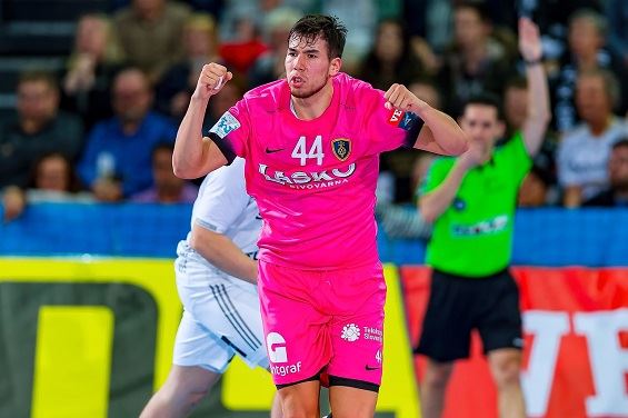
10: Celje - pink
I’m not a fan of pink at all for sports, but this kit looked fantastic. And it was for a great cause so it makes my list.
9: Montpellier - white and orange
Montpellier have some great kits, though not the combat one they wore recently. But this one is beautifully crafted and the orange trim reminds me a little of my home flag.
8: Flensburg - grey melange with red trim
I remember when the Flensburg kit was nothing to write home about. Then they went navy with orange. I liked it, but this kit is sensational. Is it black, is it navy, is it charcoal grey? Apparently it’s grey melange but it shimmers. Looks like the bomb with the red trim.
7: Pick Szeged - blue and white hoops
I’m not a fan of the normal Szeged jersey. But when they unveiled this ‘away’ jersey, I fell in love with it instantly. It made every guy look more athletic and just brightened up the screen.
6: Ciudad Real - white and purple trim
When I travelled to Ciudad Real in 2009, for the final, I saw these giants of men running in all white with the purple trim. They just looked like the biggest men I had ever seen. The numbers were in outline on the back of the jerseys. It was phenomenal. Still remember that sight to this day.
5: Kiel - black with white trim
Same game, by contrast Kiel were all in black. Now I know they have the gold trim for CL matches now, but I’m not a fan of it. The juxtaposition of all-white versus all-black is burned in my memory and for me, this is the best Kiel jersey ever.
4: Sporting Lisbon - black with lime green trim
I’m a huge fan of the hoops they normally wear (I wonder why), but this jersey is a major step ahead. It’s dark, it’s edgy, it’s just a fantastic jersey.
3: Skjern - dark green
OK, this season in the Champions League they have gone for a lighter green. I’m not mad about it. But that dark green, I don’t know if you’d call it bottle green, with the black shorts is understated, but classy. I love it.
2: Veszprém - current strip all red
I don’t know my shades of reds one from another, but it seems to me that the current Veszprém jersey is just a little more towards red than it used to be. Add to that the red shorts and I’m telling you, these guys look like giants in that strip. For me, it’s the best sporting strip and is only kept off the top by the sexiest strip ever in the history of handball.
And the winner is…
1: Ademar Leon - back with yellow trim and lion’s head
Oh my god. These guys know what they’re doing. If you want to sell jerseys outside your own fanatical supporters, this is a must have. I went for the black one because it is just absolutely amazing, but to be honest, all the jerseys they have this season are tremendous.
So there you have it. It won’t be everyone’s cup of tea, but like I said, there’s really no rational reason why you like one colour above another.
Except green that is, as an Irishman and a Gael.
Time for #TomsTop10 jerseys!@obrannt picks his favourite #veluxehfcl kits, featuring a mix of modern masterpieces and old-school classics! https://t.co/x9ZTQwXI77 pic.twitter.com/OGDtGbETum
— EHF Champions League (@ehfcl) October 12, 2018
Also read the previous edition of Tom’s Top Ten, where Tom answered the question: “If I were a coach, what would I look for in my players?”


